INSIDE THE SHOW
Italian scenography evolution from the 60’s till today: from black and white to design “product placement”. text by Francesca Romana Moretti
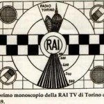
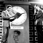
It was 1954 and RAI produced the first television broadcast in Italian history. The first person to enter the homes of Italians through the “magic box” was Mike Bongiorno, main character of the first television program in history: Arrivi e Partenze.
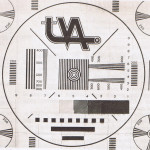
In the beginning everything was in black and white and each TV show was subject to the strict rules of self-regulation in a period where strong criticism of images and content prevailed. Since then, TVs have been constantly changing as a result of evolving technology.
Let’s analyze this evolution by looking at the appearance of scenes that have become simple pictorial backdrops, the “triumph” of lights, colors and LED screens.
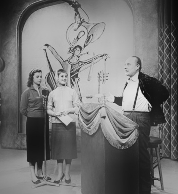
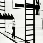
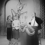
The first television programs were something completely new and unprecedented. Viewers’ attention was primarily directed at the events of the scene, the actors and the story that was told. In the case of the first game shows such as Il Musichiere (1959) or Lascia o Raddoppia (1955), the viewer identified strongly with the competitors on screen and therefore the background of the set design was not very important or impressive. For the producers it was important to engage their viewers, and so they directed their efforts more towards the social scenery. In fact, in the beginning, the sets were made of simple pictorial backdrops or curtains imprinted with two-color geometric patterns that were highlighted when displayed in black and white on TV. As the programs evolved, scenic elements were added that became an indispensable part of the program. These included the great clock or cabins for the competitors of the quiz.
Over time, many new types of TV shows were developed and they changed the notion of what was required on stage. A small stage was no longer enough. More space was needed for performances and for the public. In the years to come, Canzonissima (1959), where initially, scenery was almost completely absent, scenic elements started being placed in various ballets and spaces started being enlarged to provide more light and breathability.
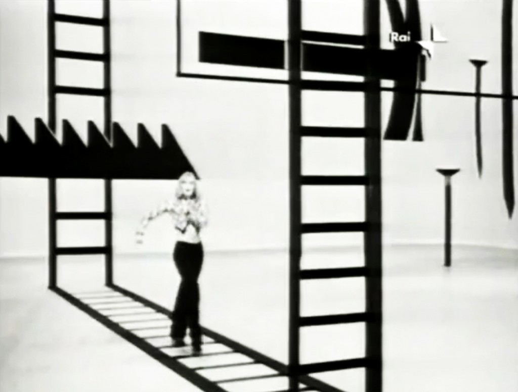
In the late 60s, Canzonissima became “modern” as a result of its references to the great Broadway musicals. Its studios were large and bright; the audience was arranged around the scene. The ballets were a great success thanks to the scenes that constituted an integral part of the show. Props were also great tools used as key parts of the choreography to enhance the dynamism of symbols.
The first neon tubes were introduced during those years, their white lights were used to highlight the contours of the scenic elements through the contrast created between light and shade.
Colors and shapes triumphed during the 80’s when television studios were enriched by a multitude of scenic elements.
These were the kitschy years; full of flamboyant colors, gold decorations and baroque elements (in costumes as well as set design) Excess and the grotesque governed, as the general belief was that more is better.
During those years the sets started to reconstruct real environments, in order to involve the viewer better. In Io, Jane e Tarzan, (1989) the stage was complete with jungle vines, trees, lakes of mud and animals. Often during this period, the themes were inspired by various films (with ideas drawn from the sci-fi genre started by Blade Runner), as in the case of Galassia 2 by Gianni Boncompagni (1982), where the scenery consisted of spaceships and robots.
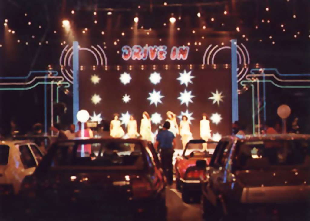
These were also the years of Fantastico and Drive In which, year after year, strived to impress the audience with spectacular new facilities and new colorful markings. The set of Drive In strived to represent a real American drive-in so dozens of cars were brought in to accommodate the “public.” These were also placed between various box offices and kiosks, and yards and yards of neon tubes enhanced the whole scene.
In the mid 80’s lights also reigned. The neon tubes most commonly used were those that allowed you to mix colors to create dramatic lighting effects. They were used in heating the stage for some editions of Fantastico, and on Sunday in almost every Festival of San Remo. During this time, names like Gaetano Castelli, Cappellini & Licheri and Armando Nobili became stars.
During the 90’s, set design became increasingly complex to satisfy the needs of games and programs such as: Il grande gioco dell’oca, the first editions of Buona Domenica, Partita Doppia, and Luna Park. Some of these programs contained physical games that involved players, so sets therefore had to follow specific standards of safety, in addition to being easily transportable to enter and exit from the studios, providing for quick scene changes.
The proportions of the designs became more important and had to take many new factors into consideration: the increasing size of the spaces and the heights of the studies, and the multitude of cameras that were placed in every corner of the studios. This resulted in more of a balance between the attention given to the protagonist of the scene and the scene itself.
The sets were then, more than ever, actual architectural projects. Floor plans started to be accurately drawn to scale with all their details being viewed and approved by all bodies that need to monitor the safety of the studios. Contracts were made with detailed descriptions of all the elements of the scene (the areas, the materials and processes) to allow for the division of works by type.
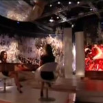
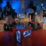
Once in the new millennium broadcasts adapted a faster pace of upgrades. This is the era of reality shows, when television studios are filled with screens and incredible lighting effects are achieved through many kinds of LEDs.
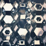
New technologies are constantly being tested, such as Modular Origami, used in the setting of L’isola dei famosi 7 or self-propelled rotating hexagonal polyhedrons that give a luminous effect to imitate a shimmering sheet of water reflecting the sun’s rays.
In recent years, television sets are witnessing a sort of “product placation” design, so that the studios are empty elements “hairpieces” to be filled up until they reach a unique identity thanks to the presence of some design elements, a particular seat (the Baba seat of Sintesi, for example, is the focus of the interviews in Le Invasioni Barbariche and Victor Victoria) or a lamp.
A particular dramatic case, that would be treated separately, is Big Brother. The house itself is a showcase for the design and production of furniture.
In its first edition in 2000, the house was totally decorated from Ikea, while today, all 11 editions have been furnished by the most famous Italian producers: Doimo, Magis, Artemide, Frezza and Busatta.
The house has grown to be environmentally friendly, attentive to energy saving and environmental resources, has solar panels, natural wood furniture and bio-stone paneling (Prestige Collection by Kerma).
In the new edition, the design is not limited only to the sets (Meritalia) but also passes into the bathroom with Hansgrohe’s Axor Starck and lighting by Magma Marchetti, in short, an exhibition of Italian design for each room.
Related Posts :
Category: Article
Views: 4210 Likes: 1
Tags: italian , review , scenography , show , television , tv
Comments:
Info:
Info:
Title: INSIDE THE SHOW
Time: 13 giugno 2011
Category: Article
Views: 4210 Likes: 1
Tags: italian , review , scenography , show , television , tv

