Info:
Title: Venice - Code: D9T5R2Contest: Venice / 2011
By: F. Alarcón-Ruiz / B. M. Daron
Views: 2868 Likes: 0
Votes:
BJARKE INGELS7 NERI OXMAN6 ELENA MANFERDINI6 MARIA LUDOVICA TRAMONTIN4 BOSTJAN VUGA45.4
Venice
This project explores the architectural occupation of residual urban spaces and their potential to transform conventional programs and activities. It is premised on the observation that Venice, Italy has organically formed over time through an extensive notion of accretion, producing unusual and provocative sites where architecture can be challenged to discover other modes of occupation. [Posturely] Challenged, is interested in how these awkward conditions might generate an awkward architecture, one where the exception challenges our conventional understandings of place and use.
Historically, the city has been organized around an organic network of small, decentralized open plazas or campos. As the city has evolved from one of industry and shipping to one of tourism and cultural events: such as the Biennale, Carnevale, and the film festival, the city itself could be described as one large museum containing points of interest. The project, a museum for the Biennale, is conceived not as a large, single building but as a disbursed network of smaller event buildings regularly distributed throughout the district.
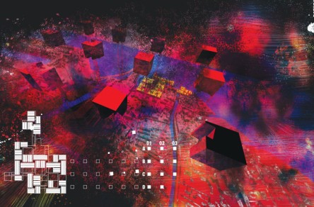
A series of 15 cubic meter volumes are organized in the city fabric by extending the urban grid originally posited by Le Corbusier in his Venice Hospital proposal and used again by Peter Eisenman in his unbuilt Cannaregio project. The strategy generates a kind of de-facto catalogue of urban sites to explore the myriad conditions of the in-between. While the location of each volume is egalitarian and predictable, the specific conditions of each site produce a wide range difference in urban and architectural conditions, from the regular to the highly particular.
The volumes serve as an engine to mine and catalogue difference as well as to challenge conventional means of exhibiting and viewing for the Biennale. A variety of architectural incisions are applied depending on each particular intersection. In some instances these new pavilions utilize the faces of exciting buildings as a sort of skin graft, while in others a new surface layer is applied up against, yet independent of, the existing context. Over time when some of these buildings begin to collapse and sink, due to their weak foundations, walls and/or spatial configurations of the pavilions begin to evolve while simultaneously indexing moments of the city’s history.
By superimposing the soundings within the planimetrically intricate urban fabric, circulation routes throughout the city become re-choreographed. When new boundaries are formed along primary streets, secondary paths of travel become crucial and begin to play a more primary role within the city. The pavilions are comprised of a light perforated mesh to contrast against the juxtaposed stone textures of the existing buildings. The exterior faces of the pavilions consist of iconic graphic images of cropped cereal boxes acting as a novel form of billboards when in visioning this future Venice, Italy through the eyes of Los Angeles.
_SPECIFICS_
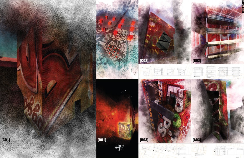
[B03] blocks a primary path within the district that leads to the campos of Chiesa di San Geremia. The mass of the sounding itself creates a dead end condition and is designed with a series of other choreographed dead end routes within the interior. It consists of a main [public] entrance for visitors and a secret [private] back door exclusive for the locals. Visitors are committed to a particular line of travel as they enter the pavilion. Three sequential exhibit spaces of different sizes and proportions are viewed from the ramping system which may be curated in relation to another set of three exhibiting areas of the same dimensions at the banks of the stairs. In the end, a viewing platform at the highest elevation opens to the next pavilion [A03] which is now observed in such a close proximity though is inaccessible within reach.
[A03] interrupts the street to the campos but does not block it completely the in the way that [B03] does so. After one detours around [B03] and approaches [A03] they experience a different notion of integration to the surrounding as the pavilion spaces are literally carried through the existing building via a punctured entrance at ground level that opens to a viewing well looking up that is influenced by an existing court then augmented by the new pavilion. Offset from this entrance the pavilion offers a new facade that is comprised of a stacked ramping system with undulating displays at sub levels that suggests a more dynamic notion of viewing art. An interstitial layer is created amongst the rooftops that leads to an opposing viewing well oriented downwards.
[B02] open to it’s neighboring park is where it’s entrance is oriented towards. This untouched sounding is used to juxtapose the notions of exhibiting/viewing a piece of art in its totality verses viewing other pieces only through glimpses and thresholds without ever being exposed to the entire artifact. Through the element of sectional poche, a vertical pocket houses various perspectival viewports at different elevations angled in such a manner as to see some of the art piece from a lower level then later viewing the rest of it from a higher platform. To circulate from one level to another, one must walk along the extensive ramping system that serves as a giant gallery pit for showcasing much larger sculptures in a more open fashion.
[C02] though the pavilion engulfs a pathway, when one enters [C03] they can walk through it with a brief, interior detour. With a variety of surrounding building elevations [C03] explores the idea of [mis]fitting programs into the indexed residual spaces. Rooftop datums are utilized to determine the orientation of an auditorium as well as the shifting and indexing of a primary staircase. In search for awkwardness these moves investigate the threshold in between pleasant/ideal condition before they turn bad/uncomfortable.
[D01] the residual volume from the sounding is juxtaposed along the existing building on one side, and open to a garden on the opposite. It is comprised of five floors. The second and forth floors are comprised of glass volumes, uninhabitable, that are used only for displaying art. The galleries are exclusively viewed from either the floors above or below as well as from the residencies adjacent to them. Within the noirscapes of Venice, these preserved galleries glow in a romantic fashion depicting two glass volumes hovering above ground.
[C02] defines a performance stage by projecting two perpendicular lines from the corner of it’s existing building, creating two separate seating areas along the building facades. With this notion, though the different audiences do not view each other, they view the same performance and the performers cater to two audiences, simultaneously. Although the residents from the existing building are able to hear the performance their views are exposed exclusively to the audience, playing of role of a performance viewing a[nother] performance.
Info:
Title: Venice
Time: 7 giugno 2011
Category: Venice
Views: 2868 Likes: 0
Tags: Architecture , Biennale , Le Corbusier , Los Angeles , Pavilion , Peter Eisenman , Venice , Venice Biennale


